.

.

Tuesday 29 October 2013

Changes from Storyboard in First Draft

During the process of creating my first draft music video, I have removed shots that I initially incorporated into the video in my storyboard. I have changed three of the planned shots, which all focused around the artist using a cigarette as a prop to represent her reckless nature. However, when it came to filming these shots and drafting them into my video, it made the video seem less sophisticated and created the wrong image. Although there were three shots including the cigarette as a prop, these shots appeared to be irrelevant and, when testing alternative shots as replacements, the new shots proved to look better aesthetically and fitted in with the video as a whole. Therefore, I decided to change these shots (Shot 31, shot 38, and shot 52). I feel that my video looks more professional without these shots and that the decision to remove these was appropriate. I have still achieved a reckless element to the video, that these shots were initially used to reflect, and therefore there was no substantial loss or impact to the concept of the video.


Outdoor Shots - Change from Dark to Light

When I first initially generated a concept for my music video, I scheduled to film the outdoor/car park/bridge shots in the evening time when it was dark so that the natural lighting - i.e. traffic lights, car lights, street lights - were accentuated. However, when the time came to filming these shots, the practicality of the lighting was not like I had anticipated.

The lighting was not perceived well through the camera as it resulted in a 'film grain' effect on the shots. The lights from the cars and street lights also created a glare that was noticeable on camera and this was unwanted - both of these effects made the shots look unprofessional.
Amongst this, the impracticality of filming in the dark was due to the location in which we were filming - the centre of a town. This meant that getting to and from the location with all the equipment was difficult and this was only managed to be achieved once successfully, which is when I discovered the errors and downfalls of filming in the dark.

Therefore, I made the decision to change the lighting of these shots and film during the daylight instead of darkness/dusk. This improved quality of the footage recorded by the camera as it focused completely on the subject of the artist and there was no glare or issue of a film grain effect resulting on the camera. By filming in the daylight, I was able to schedule sessions with my artist more easily and even decided to travel to the centre of town on two occasions in order to achieve the best quality shots possible. This meant that the lights emerging from the John Lewis building were not evident within filming, however this was the sacrifice that I chose to accept when filming in order to achieve high quality footage.

Monday 28 October 2013

Digipak and Magazine Advert Feedback/Improvements

I have received feedback concerning my first draft of the digipak and magazine advert for 'M-'. Overall I was satisfied with some of the comments made, however this has helped me to identify improvements that I will need to consider and make a plan of what I am going to do to improve my digipak and advert over the course of the next two weeks.

Magazine Advert
  • Re-shoot the photograph's used for the main images - changing the costume and make-up. There is also said to be too much shadow as a result of the positioning of the artist and so the lighting will need to be considered carefully when taking these photographs so that the same error is not repeated.
  • The header on the magazine advert should be repositioned to the same layout as that on the front cover of the digipak to create consistency.
  • Change the release date so that it falls on a Monday.
  • Add the 'Glassnote' record company logo.
Digipak
  • Re-shoot the photograph's used for the main images (front cover) - changing the costume and make-up. The shadow and lighting issue is the same as stated above. 
  • Line the header up with the images by moving to the right (front cover).
  • Ensure that there is an equal border at the top and the bottom of the main images (front cover).
  • Reconsider the images used on both the inside right and inside left. Aim for a more sophisticated approach to match the images that are on the front cover.
  • Cut out the second header of 'M-, Matutine' (back cover).
  • Reduce the size of the font used for the legal information (back cover).
  • Add catalogue number (spine).
  • Position 'M-, Matutine' into the centre (spine).
Many of these improvements that I need to complete before Friday 8th November are simple tweaks that can be achieved in minimal time on Photoshop. However, I will need to schedule a photoshoot with my artist (Jordan) before this deadline so that I can overcome the issues with the images. This will ideally be this weekend to allow a full day for the preparation of the shoot (costume, make-up, and set up) and for the actual shoot itself. However, it is down to Jordan's availability in co-ordination with mine so no definite date can be scheduled as of yet.
The location will be at my own home, as a blank wall is all that is needed for the backdrop of the shoot and the shots that will be taken are only simple mid-shots.

Sunday 27 October 2013

Video Editing Progress

I have recently began to edit the filming that I have done and begin to create my music video according to the storyboard and animoto that I have created previously in the post-production stages of this process. I am using iMovie to create my music video, which is a relatively simple but effective media platform to use in such circumstances. By using this platform on my Macbook Pro, I am able to continue with my editing outside of school hours so that maximum attention and time can be spent on producing a first draft of high quality. All of my shots are stored in a folder on my laptop and are backed up on a memory stick to ensure that I can access these pieces of film at all times necessary. I am pleased with what I have achieved so far and editing this first draft is building upon my knowledge and experience in using iMovie, which can then be further used when editing next drafts of my video - improving at each stage.

Friday 18 October 2013

Digipak and Advert Analysis/Review


I decided upon a four panel digipak design due to the simplistic approach that I was taking, with both of the inside panels containing no text but two unexpected and simple images that reflect the new wave genre of the music. Both of these images are abstract in concept and colour, as they appear to have little relation to the track names that they are enclosing. I have edited all the images, using various methods, that are seen across the digipak to create this neo-psychedelic aesthetic. I edited each image either using the Photoshop media platform directly through adjusting exposure and hue, or using different photo filters that are accessible on iPhone applications. This had the best effect on the inside left image as this was taken on a disposable camera and features Jordan in a natural environment that wasn't staged - challenging the conventions of what is expected from a female artist. These images found on the inside right and inside left are very similar to those found in an OFWGKTA digipak that I previously researched, and this acted as my inspiration when selecting and editing these images. This aspect of the digipak is based upon the aspiration to break conventions and expectations of a female singer's image.

I pursued with my initial concept of including a photo-booth technique of the artist on the front cover of the album similar to that of The Crookes album. I feel these images reflect the personality of the artist and will build upon the audience's knowledge of the artist. These images are also edited by using a filter called '1977'. This gave the images a slightly pink tint to coincide with the colour palette already established by the other images. The front cover has minimal text, including only the title of the album and the title of the artist - these are the most important pieces of information that needs to be presented to the audience and, to create a stripped back style, this is the only text that appears on the cover. This text is in then repeated on the spine of the digipak in the same font and colour.

This minimalistic style is continued onto the back of the digipak. The text on the back cover is the same as that used elsewhere in the digipak and is a simple, clear font 'Cambria'. Having this white text layered over a black background is a simple contrast but makes it stand out to the audience in an effective manner.

This font is also used in the magazine advert, creating consistency.
The images are also the same, using the same filter, and presented in the same order as that in the artwork of the digipak, however blown up to a bigger size.
I have also created a minimalistic aesthetic for the advert. The information presented to the audience is only the necessary information and is presented in the most simple manner for ultimate minimalism.

First Draft Digipak and Magazine Advert


Tuesday 15 October 2013

Magazine Advert Analysis

Magazine Advert Analysis by SophieNutt

Review of Filming Day (14/10/13)

Yesterday was the second session of filming that I have completed with Jordan in preparation for the editing of my first video draft. This period of filming focused on the development of the projection shots, including the moving images being projected onto the artist whilst she performs the lyrics in front of the camera. These shots play an important role in relation to the disorientating and abstract elements of the video and represent the "neo-psychedelic" genre of the music.
Each projection was filmed once, with Jordan performing the song the whole way through once each time. Therefore, I ensured that each possible shot that I need with each prjection would be covered in the least time consuming manner. I was then planning on re-recording the specific shots that I needed, however to the time restraint that we suffered from, it was difficult to do this.

Jordan is a performing arts student and therefore was suitable for these shots that were not specifically directed or instructed, as I wanted to avoid the shots looking choreographed, and therefore she was able to perform imaginatively and confidently.
However, another session of filming concerning the projection shots may need to be scheduled because lyrics were lip-synced incorrectly at times and some camera angles were at a minor error. We were late starting to film, an estimated time of starting would be 5:10, and therefore this only gave us an hour to film before having to depart from the college. If another session is to be scheduled for the same location and shots, I will ensure that we have more time by establishing a day that has more room for time.

As before, tweets were written on the Matutine Twitter account to keep the fans and audience in anticipation of the video, and photos were taken to upload.
I made the decision to remove the red lipstick that was planned to be worn in the post-production period, as I felt that this colour clashed with the vibrant colours being onto and behind the artist. This is similar to the reason why I chose to disregard the planned scrunchies that were to be worn by Jordan. I wanted the costume to be as neutral as possible whilst witholding a strong sense of style, as this would ensure the best quality would be extracted from these moving images and filmed on a high quality camera. Therefore, all white was worn by Jordan (as seen in the photo above) as planned.
A tripod was booked from the Media department and used within this session of filming to create a steady shot in an attempt to achieve the highest quality and most professional looking images. Therefore these shots were an improvement from the test shots that I first conducted within my research and planning.
Overall, this session of filming was successful and the shots produced as a result of the evening are of good quality and achieve the aesthetics that I was aiming to produce.

Saturday 12 October 2013

Make Up and Camera Test

Review of Filming Day (12/10/13)

Today was the first scheduled day of filming for the Navy music video. The shots that were to be filmed were the outdoor locations - including the Highcross car park, Highcross bridge, and the roadside underneath this bridge.
In a previous post, planning this day of filming, I had looked up the weather forecast for this evening and it was likely to rain. Due to this prediction coming true and the rain falling very heavily, I was unable to film outdoors, however I did complete the car park shots.
Even though it was possible to film indoors in the Highcross bridge, the rain would be seen through the glass and it would be inconsistent if the rain was not falling in the outdoor shots - making the video unrealistic. Although this is a minor issue, it is something that I feel would affect the quality of the final edit and it is not worth risking.


As said, the car park shots were completed and I am happy with how they appear on camera - after we managed to focus the lens properly.
Throughout the day, there has been tweets posted across the Matutine Twitter account blogging the events of the day and uploading pictures throughout to keep the 'fans' in anticipation of whats to come and keep them in the loop.

The costume was changed slightly in the shoot today, as Jordan wore her black disco pants instead of black plastic skirt. I made this decision because I felt that the disco pants created a much more positive appearance than the skirt, as this appeared overdone and over thought - which is not what I wanted Jordan to look like. The disco pants also proved more practical when the weather began to turn.


One shot in the car park was also changed slightly, as Jordan was meant to be seen next to a pillar. We did attempt this shot, however I decided that this looked too posed and fake. Therefore, I took the decision to create the same shot but not next to a pillar - just on the outskirts of the building with the rain falling either side of Jordan and the mesh fence behind her.


As the weather is the key factor influencing the success of this shoot, I shall research the weather forecast nearer the time of the next filming session and gain an accurate prediction. 

Wednesday 9 October 2013

Filming Session 14/10/13

This second scheduled filming session is for the projection shots in the music video. I have already booked the studio room and the tripod for Monday 14th to ensure that these facilities will be available and my time is being spent as efficiently as possible.
Jordan is able to arrive at roughly 5pm, or just before, and so this would mean roughly staying to film until 6pm at the latest. I will need to make myself aware to others that I am on the premises as this is slightly later than the majority of after-school sessions.

Jordan's hair and make-up will already be completed by the time that she reaches the studio and all that will be left to do is complete the costume - Outfit #1 - for the filming to take place.
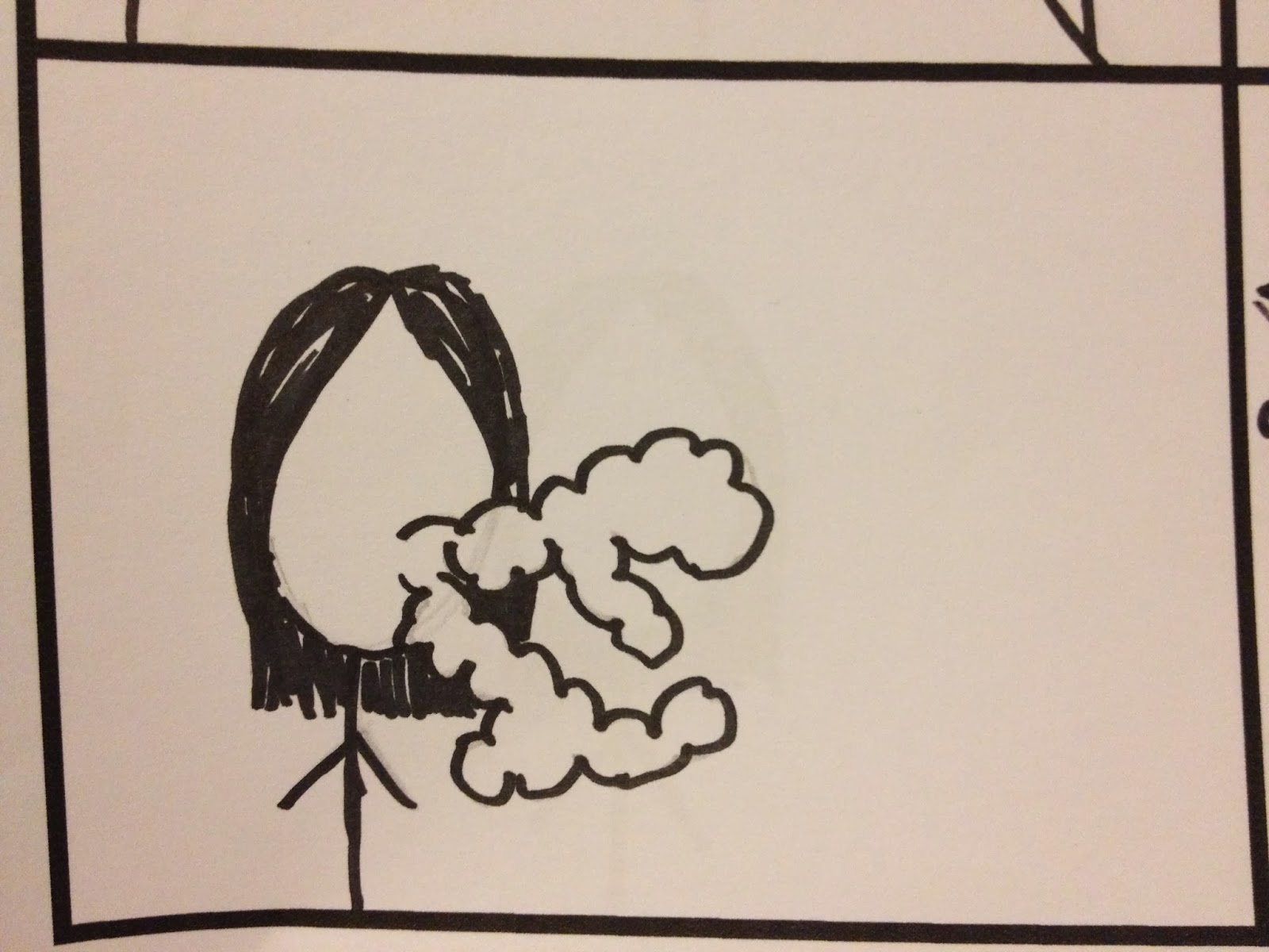
In preparation for both the filming days already planned, I will ensure that Jordan knows the lyrics and that she learns them - however I will also keep a blown up, printed version of the lyrics for within the duration of filming in an attempt to prevent any errors in the lip syncing.

Each projection/moving image will be filmed for the duration of the whole song numerous times so that errors are minimised and I know for definite that I have achieved the shots that I need for each scene.
The storyboard will be frequently referred to throughout, to ensure this further.

Magazine Adverts #1


Filming Session - 12/10/13

As mentioned in previous location posts, numerous outdoor shots are to be filmed in the area of Leicester - specifically Highcross bridge and car park, as well as the street situated below the bridge - in the evening time.
Due to the season of winter approaching, the evenings are slowly becoming darker at an earlier time. This is beneficial when filming these shots as it means there is more available time to film in one period and any elements of filming that may go wrong can be recovered in this time. Dusk is roughly planned to arrive at 5:30 and this is when filming may commence.
The pre-production stage has now ended as I have a detailed and planned storyboard/animatic, as well as an equipment list and a costume/hair and make up list that will be constantly referred to during filming.

Schedule:
4:00pm - Hair/make-up/costume to be completed. Outfit #2. This will be frequently touched up during short breaks of filming to ensure consistency in the appearance of the artist.
5:00pm - Begin filming in the Highcross car park. Dusk may just be breaking - as long as the lights are on in the car park then this is dark enough as the sky cannot be seen from the inside. Therefore I decided to begin filming here.
6:00pm - Move filming to the Highcross bridge. By this time, dusk would have fallen and the lights on the John Lewis building will be visible.
6:30pm - Continue filming on Highcross bridge, however now move focus to the shots overlooking the street and moving traffic below.
7:00pm - Move onto the roadside shots below the Highcross bridge. It will be dark and dusk would have fallen. Continue with this filming until finishing. This section of filming will take a longer amount of time than previously because of the variety of shots and angles incorporated here and the location impracticalities.

This schedule is not 100% accurate and timings may change on the day, however this is a time frame that I will try to stick to and has forced me to plan my shoot. There will be breaks within these time slots to touch up make up and costume, as well as any refreshments that may be needed for either myself or Jordan.

Weather Forecast - Saturday 12th October
The weather forecast suggests that from 4:00pm onwards there may be a chance of light rain. This is obviously not an ideal forecast due to the outdoor nature of the shots that I am filming - rain may have an affect on the camera lens and/or the costume and make-up of the artist, etc.
If this BBC weather forecast proves to be right, the filming may have to be re-scheduled for a day that has little chance of rain. However, I will proceed with the filming and prepare to take precautions if the rain does start to fall.
The rain does not affect the filming during the shots that take place within the car park or bridge as these are sheltered areas, however to create consistency the weather - idealistically - needs to be the same throughout all locations, as well as the brightness of the sky.

Finalised Costume/Hair and Makeup List

There will be two main outfits that will be worn by the artist within the video - one outfit for the shots when the projector is being used and another for the outdoor shots. As previously stated, I want to achieve a distinct style and image for the artist and a 'wayward' appearance.

Outfit #1


Outfit #2


 (Hair)

Outfit #1 = The projection shots outfit. 
As the outfit is plain white, it will prevent any clashes against the costume and images. 
Hair will be half up and half down - tied with a scrunchie.
Make-up will be minimal on the eyes, however bright red, matte lipstick will be used.
Shoes will not be seen.

Outfit #2 = The outdoor shots outfit.
This outfit contrasts with the slightly tame outfit #1, and this is where the star image will begin to be identified. 
Hair will be tousled and messy, with no accessories.
Make-up will be heavy on the eyes (smokey), however plain and neutral on the lips and skin.
Shoe choices are black Juju Jelly's (as seen in the photo), black converse, or black creepers - yet to be decided. 

Finalised Equipment List

During the filming process there are a number of pieces of equipment that I will need to use in order to ensure a professional quality and accurate production.

To film the video, I am using a digital SLR Nikon D3100 camera as the camera's advanced imaging system assures outstanding quality and it's subject-tracking AF keeps subjects properly focused - meaning that the artist will always be in focus over the background unless wanted otherwise. After shooting, I can frequently view what I have just filmed on the large 7.5cm LCD monitor so that I am perfectly aware of what I have shot and whether it is acceptable. I can also perform simple editing tasks like trimming scenes before or after a designated point, even before I begin to edit finally on the software.

For projecting the moving images onto the artist, I am using a pre-installed projector owned by the Media department within the school and in the AV Studio. The projector is installed from the ceiling to give height and an appropriate surface coverage. It is simple to use, however results in good quality moving images being projected. I have already tested the usefulness of the projector in my test shots (shown in a previous post) so that I know the effect that this has and I am certain that it will deliver the expected quality during filming.

As a result of using a projector such as this, I also took the decision to use a projector screen to ensure that the moving images were projected onto a smooth surface: improving quality and enhancing the professional aesthetics of the video. This will also be provided by the Media department.

I will also use a tripod when filming the projection shots - and depending on the mode of transport to leicester - I am hoping to use it on the outdoor shots. As I do not own a tripod, I will need to grant permission from the Media department to borrow one for the allotted filming periods. Alternately, I shall borrow one from a friend. By using a tripod, shots will be steady and level, avoiding any shaky/unprofessional scenes which could damage the overall quality of the video.
The only exception when not using a tripod will be the scenes when I track Jordan walking across the roadside as it is not necessary for shots to be completely steady and a tripod may restrict movement. 

Lighting:
There is no lighting being used within the projection shots other than lighting emerging from the images and the projector themselves, as when lighting was used it had a negative effect on the quality of the shots (as seen in the test shots). 
When filming the outdoor shots, lighting for the roadside will be used and adjusted by the street lights and other urban artificial lighting - car headlights, traffic lights, etc. If this has a negative glare on the shots then this will have to be resolved and considered before filming continues and a form of lighting shall have to be discussed.
Artificial lighting within the Highcross bridge and Highcross car park will be used for these scenes. 

Digipak/Artwork Analysis

Thursday 3 October 2013

Digipak Colour Palette

I have been considering the choice of colour palettes that I could use for my digipack and have considered using both the psychedelic colour palette similar to that used within the kaleidoscope projection shots in the music video or a simple black, white, and grey palette. When considering how to incorporate the more psychedelic colour palettes, I have decided that this could be achieved by using either colour filters/alternatively coloured lighting, using the projector to take stills, or simply using photoshop to edit the colour hue/saturation, etc. to gain the aesthetic that I'm hoping to achieve. 

For this colour palette I have taken inspiration from the artwork for The Internet's album 'Purple Naked Ladies' (shown previously in my artwork research posts). I love this colour palette as it achieves the 'new wave' aesthetics that I am hoping to achieve and has a fresh appearance. This is the colour palette that I am most likely to use for my digipak.

This is a colour palette that is orientated solely around one colour but at different shades. As the colour is pink, it is necessary to think whether this colour palette would only appeal to the female audience. Although this is a stereotypical judgement, it is something that could affect the reception of the digipak and therefore market research concerning the colour palette of the digipak would have to be completed if this palette was to be chosen.

This is the simple black, white, and grey colour palette - taken from the 1975's album artwork (also shown previously in my artwork research posts). That artwork also uses the effect of a film grain, which is something that I feel would coincide with the concept of using the photo-booth technique as the artwork of the digipak.

This is a more complex colour palette, consisting of five colours instead of three. These colours were taken from the inspiration of Chance the Rapper's album 'Acid Rap'. This is the most psychedelic colour palette that I have considered and would catch the eye of a passer-by when being sold in physical form. It would be difficult to balance these colours equally on the cover, however if the consistency proved to work, the artwork could consist of the experimental, new wave, psychedelic pop,  and neo-psychedelia aesthetics that reflect the genre of the song and artist.