.
Tuesday 17 December 2013

Thursday 5 December 2013
Wednesday 27 November 2013
Peer Feedback
Music Video First Draft


I agree with the response that Ellie has given as her feedback for the first draft of my music video. I feel that I picked exactly the right person to enroll as 'Matutine' in the video and that Jordan plays the part with such charisma, attitude, and passion - encapsulating everything that I have designed the artist to be. Jordan's appearance also contributes to this image and I feel that the costume and makeup that I have chosen support this image well.
At first I had issues with the camera as I was slightly unfamiliar with the way the lens worked in relation to focusing on particular subjects. This is noticeable in my first draft (evidently through Ellie's comment) and is something that I paid particular attention to when re-shooting. To prevent this from happening during the re-shoot, I made myself familiar with this aspect of the camera by practicing shots on inanimate objects. This helped in the preparation for re-filming as I had less issues with shots being out of focus and little to no evidence of out of focus shots can be found in my second/final draft.
Following Ellie's, and many others', recommendation of filming at night, I did so in my re-shoot. This has had a great positive impact on the consistency of moods between exterior and interior shots and has improved the overall appearance of the video.
Tuesday 26 November 2013
Monday 25 November 2013
Filming Review
This evening I re-shot the exterior shots for my music video in Leicester. I used the same locations as before, excluding the Highcross bridge and car park - as these shots were a main issue concerning the consistency across my first draft - and this time in the dark light of the evening time.
Immediately, I could see the improvement in the appearance of the shots. The lighting automatically created a more sinister mood and will compliment the interior shots well. Although the lighting is appropriate without any effect added, I will sample these shots in black and white similarly as I did with the past exterior shots in order to decide whether to use this effect in the final video. By doing this, I will be differentiating my video from the original.
After analysing the footage that I gathered, I am questioning the substance of each shot and whether there is a sufficient amount of footage for the amount of exterior shots that I am using in the music video. However, as a lot of shots are repeated in the video, this may prove not to be the case. If any significant changes are made during the editing process, the storyboard will be changed accordingly.

What to Bare in Mind When Filming

As my first draft video achieved a Level 2, when I complete this re-shoot, I will bare in mind the criteria for Level 3 and ultimately Level 4.
The standards of 'proficiency' and 'excellence' are the main difference between the two levels and therefore the standards of my filming should cohere to this.
I feel that I should pay particular attention to the criteria "framing a shot, including and excluding elements as appropriate" as this is something that I was weak on demonstrating in my first draft. This is because, not all elements that were included in the shot were accounted for and were not noticed during filming. This is something that is hard to maintain in my exterior shots that are in the public eye, however I will try my best to improve on this.
When I am in the editing process of my music video, I shall focus on the criteria of "editing so that meaning is apparent to the viewer". This will help my video appear as relevant to the track as possible and convey the appropriate meaning to the viewer, as well as creating consistency between both the interior and exterior shots - if editing and shooting are both done correctly.
Filming Re-Shoot
 I have scheduled a session of filming for today, so that I can re-shoot the exterior shots in the dusk/evening time. I will drive into town so that I reach the destination at roughly 4:30 - this will give me enough time to set up my location and meet Jordan before it starts to get too dark, as well as giving us lots of time to film. As I am driving and not using the bus, there is no limit as to how long I can film for, therefore I shall remain filming until I am satisfied with the shots.
I plan to film more close ups and less mid shots of the artist, for example when she is walking along the pavement, as the close up shots look more effective. I will readjust my storyboard accordingly before I begin filming tonight, as this will give me a structure to work within and I will have a clear plan - this will ensure that my filming is as efficient as possible.
Wednesday 20 November 2013
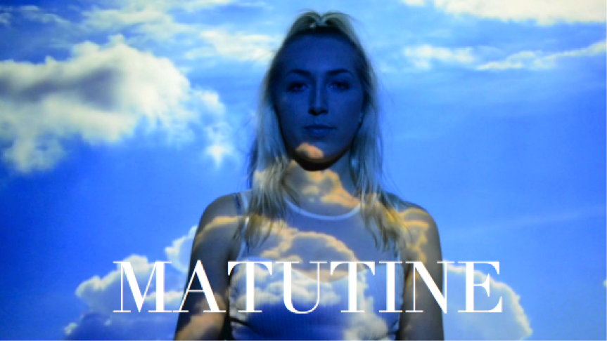
Titles Test Shot
Following my research into on-screen titles opening a music video, I have created a sample shot using the 'Cambria font' layered over two outdoor shots in black and white. The titles have the information of the artist's name 'Matutine' and the song title 'Navy'. I chose to for the text to be in Cambria font and in the colour white, so that the text is simple, clear, and bold. However, I may choose to change the font type in my final video if I find that there is a more effective font type.
Although I have used old exterior shots in this sample, I feel that this will still give me a close impression as to what this technique would look like with the re-filmed shots. I have also kept these exterior shots in black and white within this sample to create a more accurate example of what this will look like.
This technique is simple but effective, especially as the song opens with a two second silence - in which these titles can fill.

Monday 18 November 2013


Thursday 14 November 2013
Inspiration for New Digipak/Magazine Advert Photoshoot
For the shoot that I conducted today, I took specific inspiration for the poses from a photo shoot between Terry Richardson and Cara Delevingne. This photo shoot was a fun, less-serious shoot that really got across Cara's personality and 'weird' character, producing a set of candid photographs. At the mercy of Terry Richardson's notorious playful style, the laid-back shoot depicted Cara pulling several faces from her repertoire, all in black and white. This strong image and representation is something that I wanted to portray in my photographs on the digipak and magazine advert, which would create intrigue amongst the target audience.
All of my photo's are face on head-shots, unlike those of Terry Richardson's, however instead of the camera angles, I took more inspiration from the content - facial expressions and minimalist background. I feel that this is evident within the set of the best photo's that I have uploaded to Flickr and previously posted on my blog.
Cara Delevingne in Terry Richardson's studio;


New Digipak and Magazine Advert Images


DIGI, a set on Flickr.
After receiving recent feedback on my final digipak and magazine advert design, it came to my attention that it was imperative that I should take new photo's and change the images that I was previously using. Therefore, today I arranged a photo shoot with Jordan for my digipak and magazine advert. I was careful to ensure minimum shadow was created and that the images are at a high quality standard. Makeup was kept natural and minimal, and her hair was curled for a natural toussled look with half up-half down. This hairstyle allowed Jordan to pull any facial expression without her hair getting in the way or distracting the audience from these facial expressions, whilst still keeping a professional standard to the hair and makeup. A pastel strapped top was worn to allow maximum attention to be paid to Jordan herself, without any aesthetics drawing distractions.
Photo's were taken against a blank background, which complimented Jordan's skin tone and hair colour, as well as the natural makeup.
All photo's were taken as a mid shot from the shoulders upwards, to create the photo-booth effect that I was aiming to achieve.
Now, these are the raw images and have not yet been edited.
This selection of photo's have been created as a set on my Flickr profile and are a selection of the best images that came out as a result of the shoot.
Wednesday 13 November 2013
Black and White Sample (Old Exterior Shots)
Following the research that I completed concerning black and white music videos, I decided to create some sample shots in order to get a feel of how this would look in my exterior shots. As I am re-filming at night in the dark, the hue and saturation will be slightly different than what it is in these shots, however this still gives me an impression as to what this would like in my final video.
Tuesday 12 November 2013
Black and White
After researching music videos, and thinking about introducing an alternative element to differentiate my music video, I have began to consider re-filming the outdoor night time shots and then editing these shots into black and white. I feel that this will create the consistency of mood and atmosphere between the interior and exterior shots, as well as giving my video a different edge.
These are the examples that I feel create this particular mood;
These are the examples that I feel create this particular mood;
Monday 11 November 2013
To Do List
 Immediate
- Begin to consider elements that I can incorporate into my music video that will differentiate it from the original.
- Attempt to schedule a filming session with Jordan at night time in Leicester - within the next two weeks (no later than the 24th).
Not-So-Immediate
- Try and schedule another filming session with Jordan in the AVS studio for the interior shots - within the next two weeks (no later than the 24th).
- Begin to edit my music video, after desired filming has been completed, adjusting my storyboard in the process. (Replace walking exterior shots with more close-ups, and incorporate more lightning projection shots within the interior).

First Draft (Music Video) Feedback
Improvements
- My video has lots of aspects that make it similar to the original. Although this is in a lower budget way, I will need to do something that will differentiate my ideas from the original director.
- The exterior shots tend not to work. They kill the mood and create an inconsistent atmosphere to the one that I have created with my interior shots. I will need to film at night (however this would make it even more similar to the original video) or add an effect to the exterior shots to achieve a more compatible mood.
- Rethink the exteriors - use more close ups, as these look the most effective, and less walking up and down.
What Works Well
- The performance elements in the studio work really well.
- The artist is very confident and self-assured.
- Film more in the studio if I can - this will give me more options of shots to choose from.
Level 2.

Friday 8 November 2013
Digipak Images
Sadly, I have not been able to arrange a photo shoot with my model and artist, Jordan. This was unable to take place because of the busy schedule that we both have as students. Therefore, I have used images that I took in a previous photo shoot that took place when Jordan was the model. I have still changed the bottom left image on the front cover and magazine advert, however, because this needed to be changed as an improvement because of its similarity to another image in the first draft. This photo was also taken in the previous photo shoot, however I have edited it and used the same '1977' filter that I used to edit the other images.
 Although these photographs were taken on another occasion, I still feel that they represent the artist in the correct way and communicate her personality and image with the audience clearly. The photo's look professional and are of a high quality - as I used the same camera that was used to record the footage for my music video.
I have learnt that I need to be more time conscious and manage my time more precisely with a clear plan in order to prevent anything like this happening again in the future.
Overall, I am satisfied with my final digipak and magazine advert design. Although I designed numerous drafts of my digipak, I made the decision to use the definition of 'Matutine' on the inside left panel. By using a definition in a simple, clear font, the digipak looked simple and minimalistic. Although it breaks the conventions of the typical, expected digipak - it reflects the genre of the music that the artist is creating as it is new wave and experimental, breaking the conventions.
I felt that the the other two designs looked 'out of place' and either contrasted with the overall digipak design or clashed due to appearing too similar. Therefore, I made the decision that this final digipak design was the most aesthetically pleasing, as well as having an interesting, unique element, and therefore chose this design.
Although these photographs were taken on another occasion, I still feel that they represent the artist in the correct way and communicate her personality and image with the audience clearly. The photo's look professional and are of a high quality - as I used the same camera that was used to record the footage for my music video.I have learnt that I need to be more time conscious and manage my time more precisely with a clear plan in order to prevent anything like this happening again in the future.
Overall, I am satisfied with my final digipak and magazine advert design. Although I designed numerous drafts of my digipak, I made the decision to use the definition of 'Matutine' on the inside left panel. By using a definition in a simple, clear font, the digipak looked simple and minimalistic. Although it breaks the conventions of the typical, expected digipak - it reflects the genre of the music that the artist is creating as it is new wave and experimental, breaking the conventions.
I felt that the the other two designs looked 'out of place' and either contrasted with the overall digipak design or clashed due to appearing too similar. Therefore, I made the decision that this final digipak design was the most aesthetically pleasing, as well as having an interesting, unique element, and therefore chose this design.


Thursday 7 November 2013


Wednesday 6 November 2013
Digipak Ideas - Inside Left Panel
As stated in my previous post, concerning my second draft of my digipak and magazine advert, I am still debating on what to include in this inside left panel to the digipak. I have researched some artists that I consider are related to 'Matutine' and I plan to trial these ideas that they have incorporated into their digipak.


Firstly, I could consider using a posed photograph shot as a close up of the artist - seen by Rihanna here. This would conform to the traditional digipak layout and the expectations of a conventional 'pop' CD. However, this is not the image that I am ultimately aiming to achieve.

The XX have repeatedly used their logo 'X' within this digipak, creating consistency, whilst also achieving minimalism and simplicity. To incorporate this design, I would use the letter 'M', representing the artist's name Matutine and the experimental collective that she is part of 'MMM'. I could use a different design within this letter and experiment with the colour palette.

Another option is to use a less conventional photograph and use a filter that creates a film grain effect, such as the image above used on Cassie's mixtape. The filter could also include the colour palette that I have originally used in my previous photograph's. This would highlight the unconventional, experimental, and neo-psychedelic genre that the artist produces.
Monday 4 November 2013
Second Draft Digipak


After receiving feedback from my first draft, I have made the improvements and readjusted my digipak and advert accordingly. The only improvement that I have not been able to make is using a new range of photo's from a new shoot - as this photos hoot has not yet been able to take place. I am currently arranging this shoot to take place this week but it yet to be confirmed by my artist. The colour scheme will remain the same in the photo's with the same filter so that it still matches the colour used on the inside right.
I am still unsure as to what to include on the inside left, and I have currently put a definition of the artist's name here. However, although this looks aesthetically minimalistic and pleasing, the interesting concept of not knowing what the artist's name means is taken away by this. I am going to look at similar artist's covers and digipak design, e.g. Cassie, The Internet, and Jessie Ware, to aid my decision when considering what to put in this inside left panel.
However, other than this, I am happy with this design and I feel that this will be very similar to my final product. I have changed the inside right panel to a more simplistic design instead of an image/graphic and this has had a positive impact on the overall aesthetics as exaggerates the minimalistic style. The colour scheme of light pink/lilac, black, and white also works well as the lighter colours are contrasted by the black, making every element stand out and enhancing the important information and features.
The advert is the final product, except for the images that are used here. The images used on the advert will still remain consistent with those on the front cover of the digipak once I have taken new photographs of the artist, so that the consistency remains.
Subscribe to:
Posts (Atom)